In today’s post I would like to share with you some of the facts about form design that are working very well and which I’m using consistently in all applications I develop. Maybe you can get some use from my approach to form design.
Here are some design needs which must be satisfied on every Access form:
- The name of a form must be visible.
- The name of a form must be an expression of its functionality.
- User must visually see all mandatory fields.
- All mandatory fields need to be presented and visible on the first page of a form.
- All fields with a default value, auto number functionality or read only property are to be designed with a different background color.
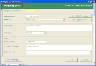
It is common to put the name of a form into the window’s title with the Forms!FormName.Caption property. I rather use Form Header Section with the label called lblFormName. This label can be larger and is therefore much more visible.
Picture 1: Title of the presented form is larger and more visible than the window’s title.
In my applications all mandatory fields have bold labels with the additional foreground color, named mandatoryLabelColor. All mandatory fields are surrounded with the border color, called mandatoryBorderColor.
Picture 2: Mandatory fields are visible on the first view.
All mandatory fields are positioned on the first page. All other non mandatory fields are positioned after first page break. With such design the user immediately knows that he/she must insert/update only the fields, visible at first sight. All other fields are below them on second page which is immediately visible with moving of the Scroll bar, which is presented on right side of the form.
I truly advice designing a form with page breaks and having the Scroll bar for easy moving between pages. From my experience this approach works better on forms with many fields than the approach using Tabs.
All fields with default values, fields with the auto number functionality or read only fields have a different background color. For example: I use yellow background color, called specialBackGroundColor. Additionally, all those fields have AutoTab property set to No.
The described approach does not require any programming and as such it is easier to manage the application in time and with new versions of Access software.

